UHN Foundation More than Hope

CHALLENGE

During the pandemic, UHN Foundation (UHNF) set out to increase donations for their ongoing COVID-19 efforts, in addition to recognizing their staff who worked tirelessly on the front lines. Due to health mandates, producing original photography for an ad campaign posed a significant challenge. Haft2 was tasked with creating a meaningful ad campaign around the idea of ‘turning hope into action’ without using photography.


SOLUTION

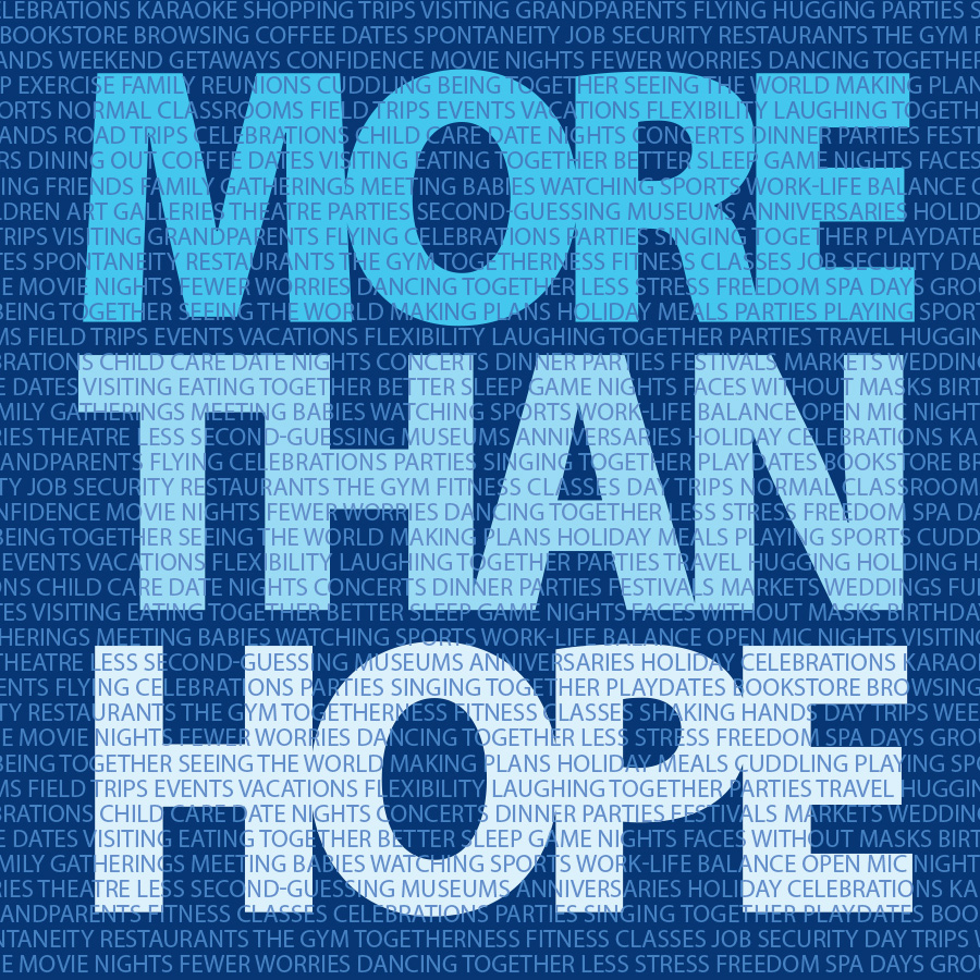
Haft2 turned to the power of language and type as a design mechanism to bring this ad campaign to life in a thoughtful way. Throughout a series of full-page print ads in The Globe and Mail and other prominent daily newspapers, Haft2 created a powerful campaign message around the idea of “More Than Hope.”

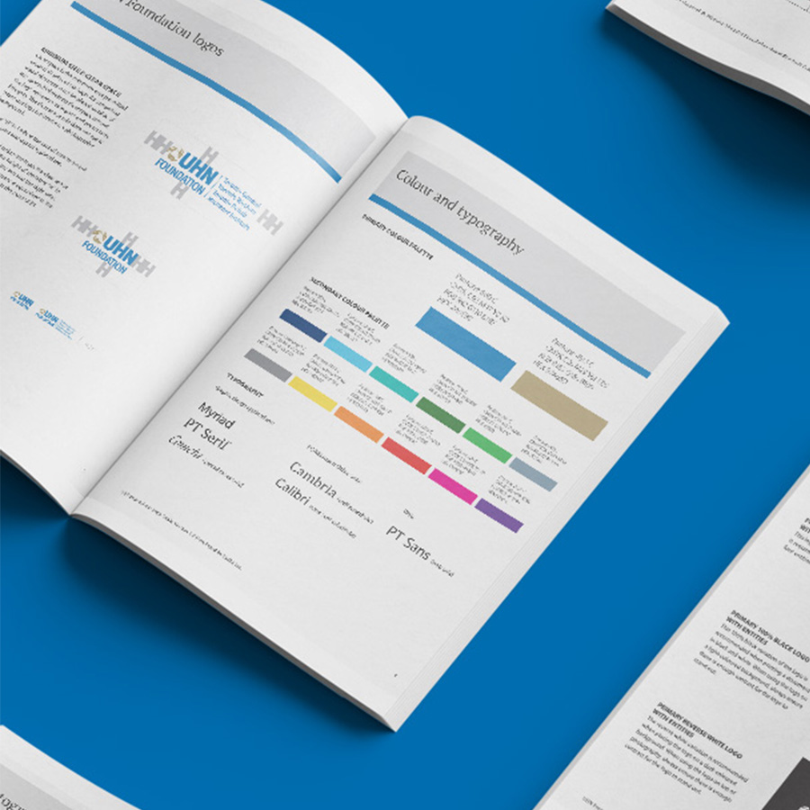
Haft2’s creative writer developed the campaign tagline of “We’re all hoping for this pandemic to be over, but hope alone won’t solve it.” for the first ad in the series. Using brand fonts, colours, and the Foundation’s “Knowledge Bar” design system, Haft2 composed a list of words that formed the background of the ad, words that reflected the lifestyle activities that society was hoping to get back to. For the second ad in the series, Haft2 created the tagline “Thanks for standing by our heroes.”, and again used type to create the silhouettes of healthcare heroes. The background words in this ad were all the first names of actual frontline healthcare workers, providing recognition for their outstanding efforts during the pandemic.

This campaign was also executed on the Foundation’s digital platforms as well.


RESULTS

The More Than Hope campaign strongly resonated with staff and donors and was successful on social media as well. The campaign raised awareness of the level of expertise at UHN Foundation, while acknowledging the hard work of staff during a difficult time. Due to its resonance, the campaign theme and style was used as the 2020/2021 Report to Donors. Today, it is still an ongoing campaign for UHNF.


The ‘More Than Hope’ campaign uses blue hues to create calm reassurance during the difficult times of the COVID-19 pandemic. The colours also act as a canvas for the typographic texture and flat illustrations which work in harmony with the campaign’s design elements.