MEDA.
/
Challenge
(01)
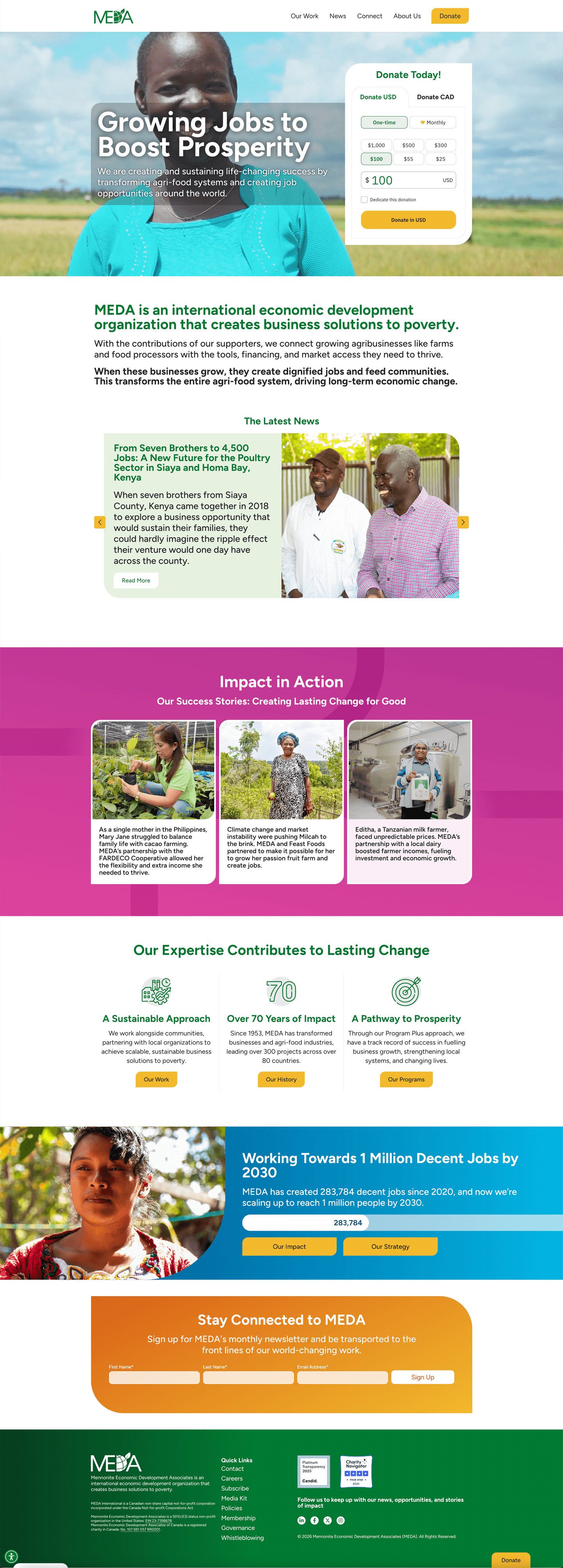
MEDA, a Canadian non-profit dedicated to supporting sustainable livelihoods through inclusive economic development, celebrated its 70th anniversary in 2024. To mark this milestone, they engaged Haft2 to modernize its logo, ensuring it was digital-first, accessible, and consistently reproduced across platforms
/
Process
(02)
Complex elements were simplified, while colour and typography were made accessible.
Haft2 carefully refined the logo’s linework to improve clarity and scalability across digital and print applications. Complex elements were simplified to strengthen legibility, while colour contrast and typographic adjustments aligned with current accessibility best practices.
To support the evolution of the identity, Haft2 conducted a comprehensive review of existing brand guidelines and introduced a refreshed typography system and updated colour palette, improving consistency and accessibility across communications. Updated brand guidelines and a practical training video were developed to support internal adoption and implementation.
/
Outcome
(03)
A fully accessible, WCAG-compliant foundation that supports the organization’s digital-first approach.
With these refinements in place, the website was updated and is now fully WCAG compliant, reinforcing MEDA’s ongoing commitment to accessibility and inclusive design.


Latest Projects.
© Haft2 Inc.
A curated selection of projects that reflect our commitment to simplicity and purposeful design.