Shaftesbury
Project Location
Toronto, Canada
Project scope
Brand Identity
Shaftesbury is a global content production company with successful franchises in television drama, kids’ programming and digital content. With the expansion of its product offering and delivery platforms over the years, additional brands had been added to their corporate roster. Haft2 was engaged to help amalgamate the assorted brands under a single brand strategy and create a new visual identity.
Solution
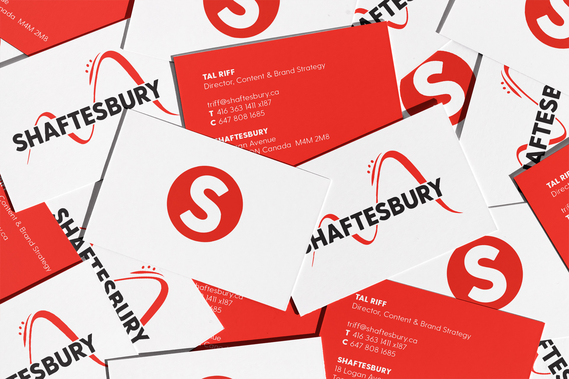
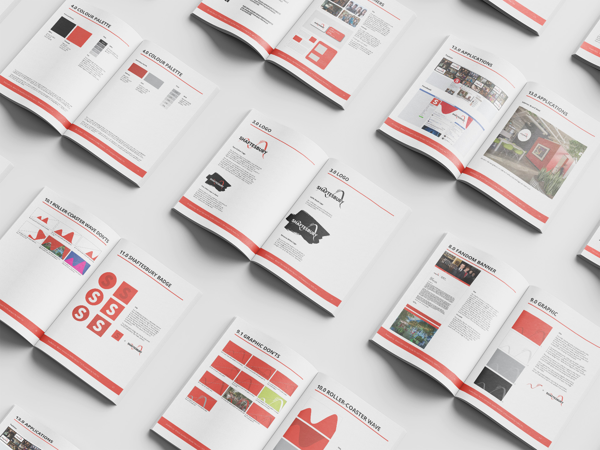
Haft2 conducted a brainstorm session with key stakeholders from across the affected brands. Once each brands’ history and attributes were reviewed, we identified common themes and strategic pillars for the new Shaftesbury. With unanimous agreement to the strategy, Haft2 developed the new visual identity. Bold type was paired with a bold colour palette. A warm red, ‘Tomango’, became the dominant brand colour because of its emotional impact and its association with passion. As the core colour of the brand, it adds a bold statement to design work and reflects their tenacious energy. We also wanted to represent the fun and enthusiasm experienced by Shaftesbury’s fan base, so we incorporated the stylized roller coaster. Together, the elements capture a mix of dependability and excitement. With the logo complete, we then created an animated version to appear at the end of each Shaftesbury production.
Results
All Shaftesbury employees enthusiastically embraced the new brand, and company CEO Christina Jennings described the resulting creative as “beyond perfect”. The fresh new look was launched at industry trade shows and through the corporate website. The animated version now appears on Shaftesbury delivery platforms and the new identity has provided a unified brand for all Shaftesbury divisions.