Mastercard Foundation
Africa Growth Fund
Project location
International
Project scope
Visual Identity & Website Design & Development
The Mastercard Foundation Africa Growth Fund is the largest impact investing program of its kind. It is made possible by the Mastercard Foundation in collaboration with the Mennonite Economic Development Associates and a consortium of partners.
Mastercard Foundation engaged Haft2 to develop a new visual identity and website to support the launch of the Africa Growth Fund (AGF), a new Fund of Funds investing in gender lens investment vehicles across Sub-Saharan Africa. The new identity and website needed to reflect youth- and women-led entrepreneurships in Africa, stand out from other Funds and adhere to the Mastercard Foundation Brand Architecture, while expressing the ambition and core goals of the Fund of Funds itself.
Given various stakeholder input and approvals, Haft2 structured a series of design sessions with the Foundation and consortium partners to ensure successful outcomes.

Solution
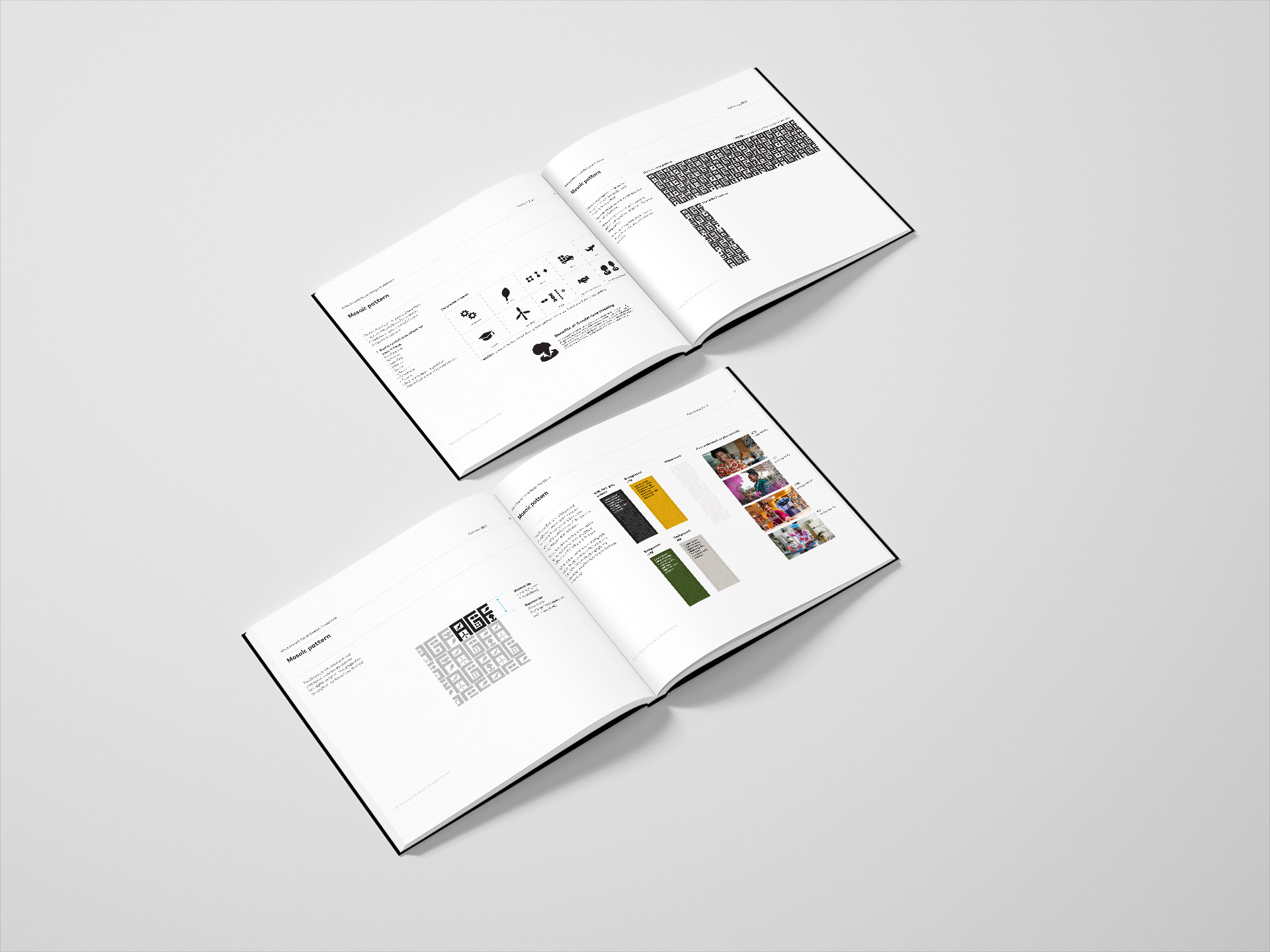
Working with the existing Mastercard Foundation visual elements as the base, Haft2 developed an additional visual expression unique to the AGF. Inspired by African textiles, Haft2 created a graphic pattern. The pattern was made up of the letters of the Fund’s acronym, AGF, and various icons representing women and industries that the Fund of Fund supports.
That became a building block to create a visual identity that captured the spirit of African patterns and adds texture to the overall brand look and feel for Mastercard Foundation Africa Growth Fund.
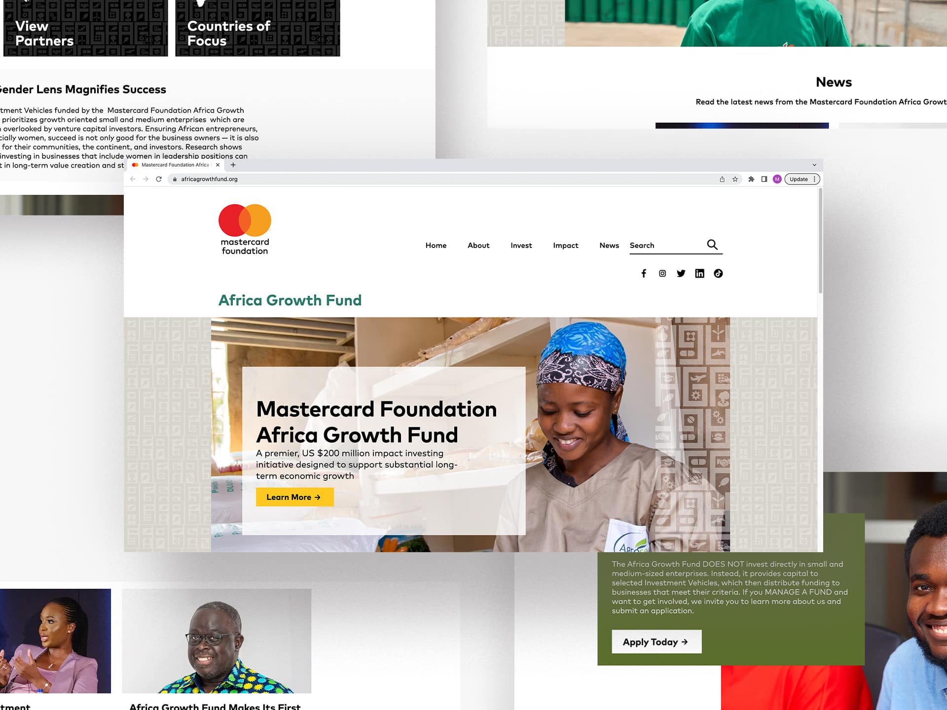
The design for the AGF website answers the needs that were identified by the client: project leadership, best-in-class and forward-looking with its modern approach. Designed in Figma and built on a unique Drupal platform called Jumpstart, the AGF site has a navigation and content structure that is clear, simple and allows users to access the content they need quickly and efficiently.
The design also uses evocative, well-composed, and richly coloured photography that engages the viewer and illustrates the personality of the Fund. The AGF’s palette of rich green, brilliant orange, and bright yellow are countered by a polished and intelligent combination of black and grey. The new website is fully accessible, meets/exceeds WCAG-2 standards.

Results
The visual identity was unanimously approved and well received by the Foundation and consortium partners and widely applied beyond the website.
