

Hunova
Visual Identity & Website
Project location
International
Project scope
Website
Visual Identity
Hunova is an enterprise human capital insights platform that leverages advanced natural language processing techniques. Hunova uses AI and machine-learning technology to make work better for workers. Their technology is a first-of-its-kind approach to understanding people at an individual level, and increasing diversity and inclusion while eliminating age, gender, race, and ethnic bias from the equation.
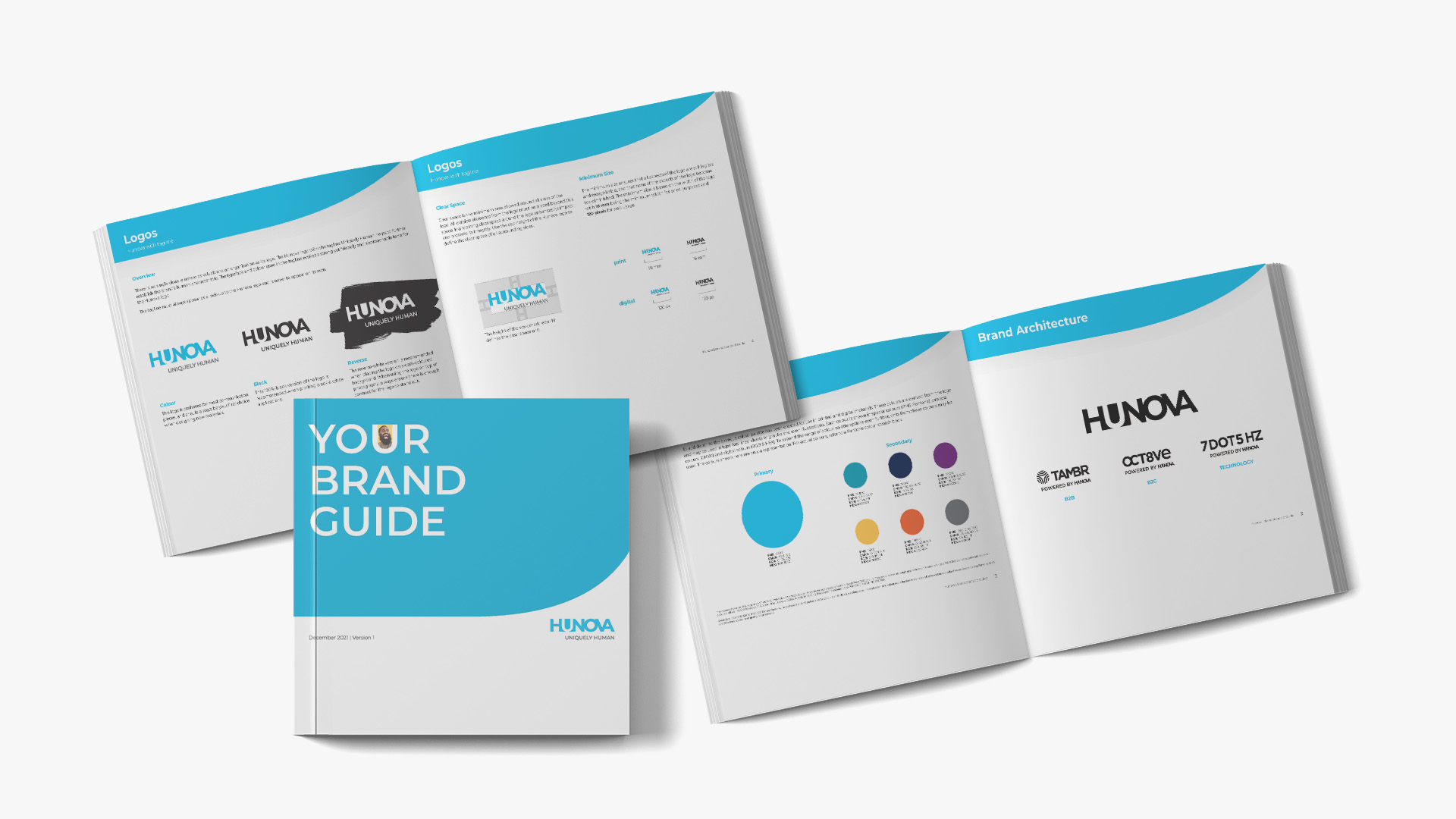
In September 2021, the client engaged Haft2 to assess and advise on their brand architecture, develop visual identities to align with the new architecture, and provide brand standards.
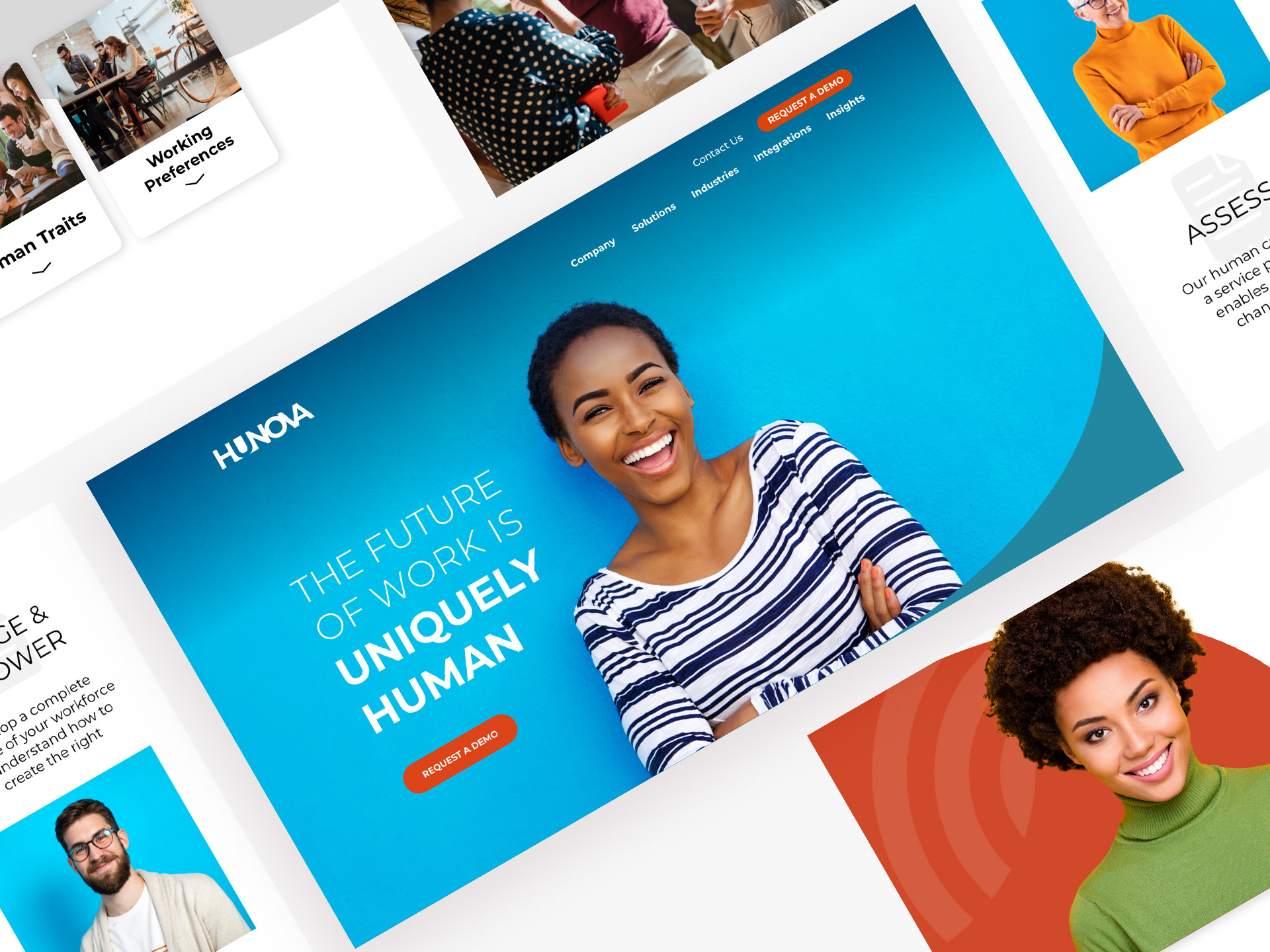
The challenge for the brand and visual identity was making the connection between how technology and artificial intelligence allows for a more personal and individualized approach to employees, and teams.
Solution
When the client came to Haft2, their corporate name was MeaningBot. Haft2 encouraged the development of a new corporate name to align with the new brand positioning we developed, Uniquely Human. The client was then successful developing the new name, Hunova, in-house.
With the new corporate name, Haft2 seized the opportunity to develop a bold and engaging visual identity for the master brand logo and additional sub-brands.
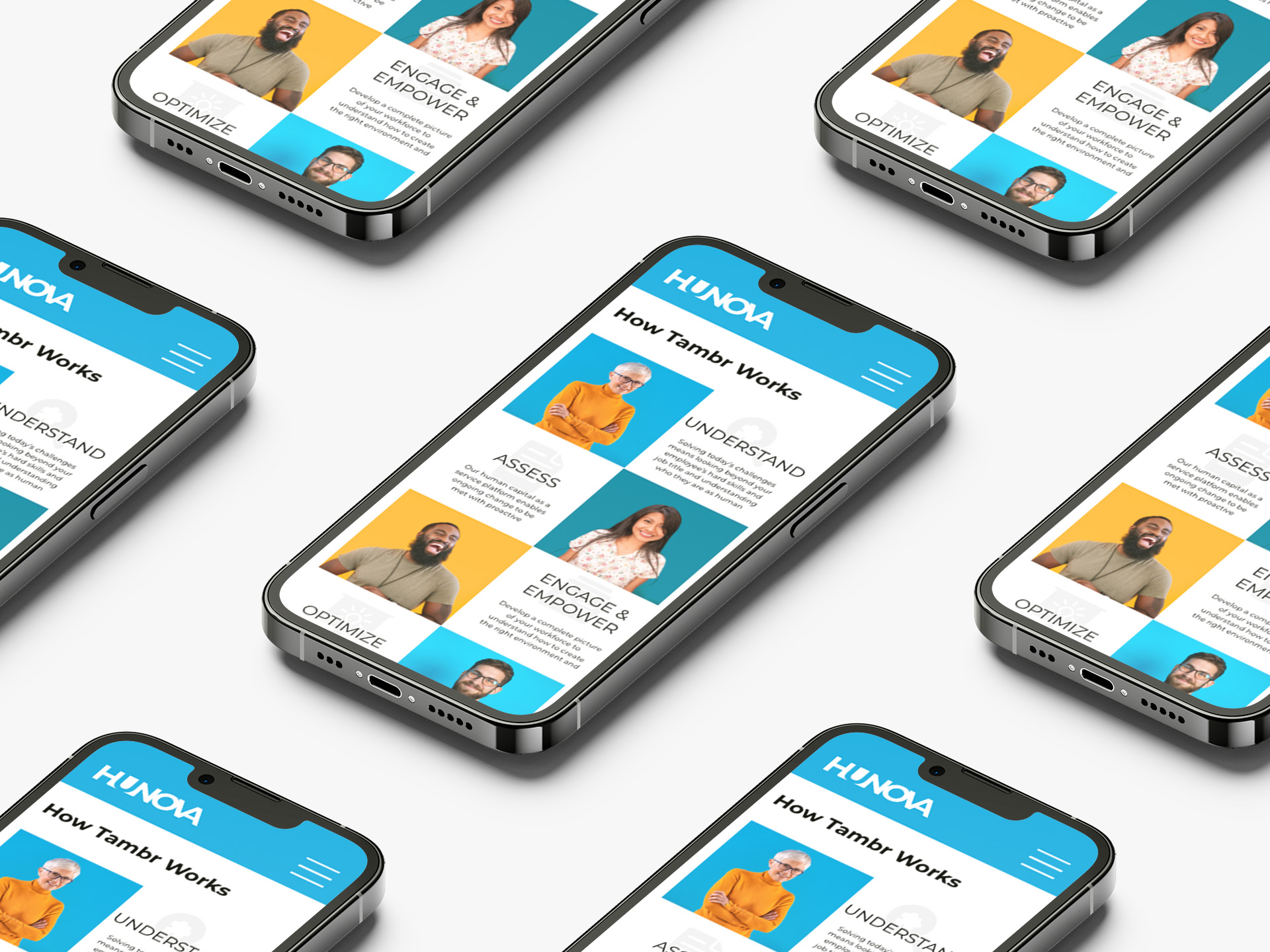
We worked with Hunova’s CMO as he developed the brand strategy to understand the various audiences for the current B2B brand. The client also wanted Haft2 to consider future plans for Hunova to become a B2C brand. In addition to Hunova, the client had several sub-brands for design consideration. Haft2 developed the brand architecture to include an endorsed strategy (Powered by Hunova) under their Tambr brand and for future sub-brands.
Haft2 explored a variety of type and graphic options for the new Hunova brand. The focused positioning, Uniquely Human, also became the main criteria in the creative brief. It was critical that the new logo design work effectively on all digital platforms. The result of the design and typography exploration led to the first three letters creating a neat negative shape for the ‘U’, making for a strong and bold ownable visual. The ‘U’ also relates the human aspect of the brand, as in YOU, the individual. Using all upper case for the wordmark, we were also able to join the V and A by sharing their vertical strokes.
The letterforms are customized to create a modern tech appearance, yet with an approachable personality to the wordmark. The U was also used as a frame for photography on various applications.
We explored a variety of primary colour options for Hunova. We landed on modern sky blue with a variety of secondary colours to complement sky blue.
Haft2 also created the logo and visual identity for Tambr, a Hunova sub-brand. Tambr is a service platform that leverages people analytics, allowing organizations to optimize their workforces for positive organizational change. To align with the brand architecture, Tambr shared the same type font, connecting letterforms in the design, as we did with Hunova, and added a graphic. A bright, yellow-based red was used as the primary colour for the words with Hunova blue used for the graphic icon.
Results
The entire Hunova visual identity was launched with the redesign of their website. The launch also included employee events, complete with Hunova SWAG. The transition from MeaningBot to Hunova was also celebrated with existing clients. Since the launch, the brand has had positive feedback, especially with potential clients receiving new business and promotional materials, setting the brand apart from competitors.
The new website is fully accessible, meets/exceeds all AODA and WCAG-2 standards.