

Helping Hands Healthcare
Brand Identity & Website
Project Location
Toronto, Canada
Project scope
Graphic Design
Website Development
Helping Hands Healthcare has been a highly regarded provider of temporary staffing (nurses and PSWs) for hospital systems in the GTA and Niagara since 1997. The long-standing agency is known for their high standards of providing excellent healthcare. When Helping Hands Healthcare engaged Haft2 in spring 2023, they were ready to update their logo, visual identity, and website.
Helping Hands Healthcare recently completed extensive qualitative research to understand their client personas and utilizing these insights, had also updated their brand positioning statement. In addition, the company had recently expanded their offering of in-home care and would be igniting marketing initiatives focused on this new core service. The company’s website also needed an overhaul to match the new visual identity and expansion of homecare offerings.
Solution
With specific insights gained from their research, Haft2 was able to identify a clear strategic direction for the visual identity and website. We understood that as Helping Hands Healthcare’s clients are not typically in the mindset to search or shop around for homecare, first impressions were paramount. In addition, Haft2 completed a competitive assessment at the onset of the project to understand core competitors and their visual identities. We completed an exercise to plot competitors on a colour wheel and discovered all competitors were currently living in the red and purple space. This was exciting news, as this meant the lighter blue and green space on the colour wheel were ownable and aligned perfectly with the emotions we were trying to convey – trust, confidence, and freshness.
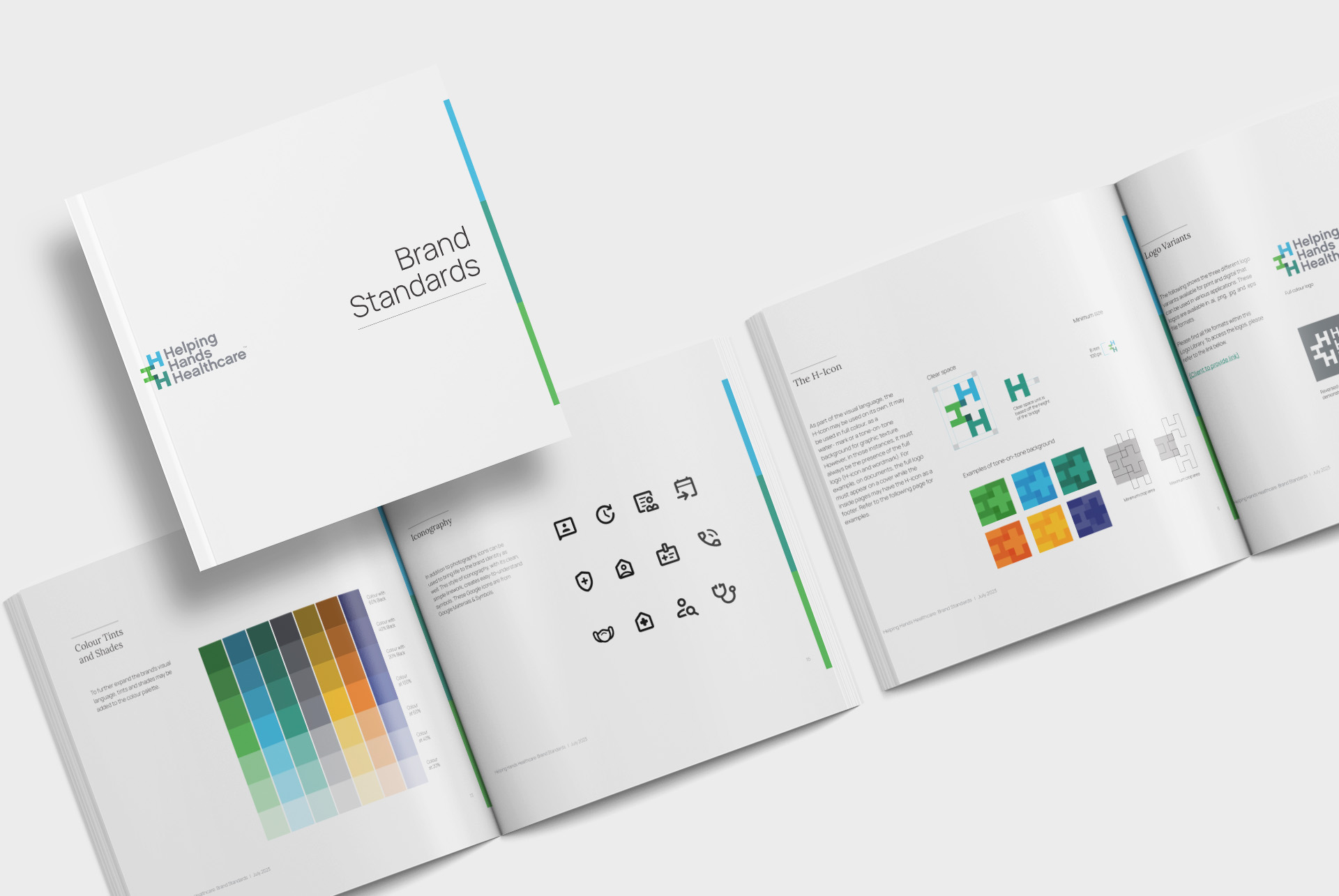
On the logo design side, the team brought together the three H’s from the initials of the company name to reveal a “visual gift” in the form of a cross or plus, within the negative space. The cross or plus is a universal symbol for healthcare and is also associated with positivity. Together, this created a strong emotional reaction to the identity and evoked feelings of empathy, empowerment, and a true connection to healthcare. The strong, scalable logo mark visually truly expressed the company’s new brand positioning and firmly planted the organization in the healthcare space.
The visual identity was carried over to the overhaul of the company’s website as well. One of the key insights in research identified the need to show potential client’s compassion and help them overcome barriers they may face when selecting a homecare provider. It was imperative for our website copy and imagery to reflect those sensitivities and show that sensibility.
On the technical side, Haft2 recommended changing the domain to a more recognizable URL and switched the website’s platform as well. The goal for the site was to provide a fresh, modern, easy-to-navigate, AODA-compliant, yet comprehensive website, which was achieved and widely celebrated amongst the Helping Hands Healthcare team.
Results
As Helping Hands Healthcare ignites several marketing initiatives, they have received positive feedback on the brand’s new identity and new website. Both components convey the brand attributes of high-quality service, trust, and compassion – and show how the company is committed to a high level of service at every part of the healthcare journey. Feedback from staff and clients alike has been overwhelmingly positive for this growing company.