Colour Research Society of Canada
Colour Research Society
of Canada

Project location
Toronto, ON
Project scope
Website
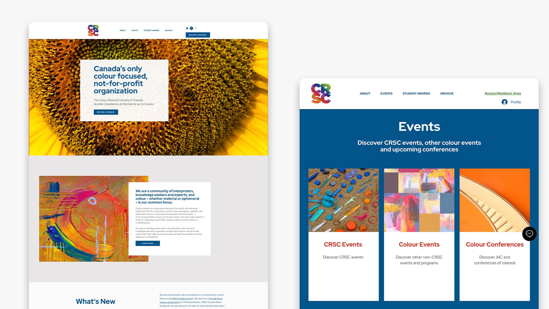
The Colour Research Society of Canada (CRSC), is a non-profit organization for colour research, focused on fostering a cross-disciplinary sharing of colour knowledge. Haft2 was engaged for two purposes: CRSC was celebrating its 10th anniversary and looking to redesign their current logo. The current logo was outdated and did not reflect the colour focus of the organization. The new logo needed to work across all applications, print, digital, environmental, and promotional; and we were asked to design and develop a website to incorporate the visual identity and better service the organization’s members and the broader public.
Solution
As part of the logo development, Haft2 led informal discussions with board members about what they were looking for in the new identity. They wanted something that expressed a modern, colourful design. They also required a strategic use of colour in the design.
The selected font was Gotham Bold. The large CRSC letters provided a frame for the spectrum of colour. The logo was designed to be used both vertically and horizontally depending on the application, although the vertical staked format was preferred when adding the full name in French and English.
Our website design approach included user personas, and meeting and exceeding AODA standards to support a mobile-first strategy. Simplified, easy navigation included the members only portion of the website. The visual approach included strategic use of colour and photography to communicate the organization’s focus on colour and design.
After investigating multiple options, we proposed Wix as the platform for the new website. Our recommendation was based on the cost effectiveness for the platform, the integration of PayPal for their membership fees transactions (without a per transaction fee), ability to use their marketing platform to manage communications to their members (rather than a third-party site like Mailchimp), drag and drop CMS editing tool and, key to the success, allow for the comprehensive and easy-to-manage membership area.

Results
The new logo met with unanimous board approval. The fresh, bold design was easy to apply to both print and digital applications. The new logo colour palette and design has extended beyond the logo to inspire various social media campaigns for the organization.
The new website accomplished all three critical success factors, meeting or exceeding them:
1. Encourage existing CRSC members to set up a profile on the new member directory section of the website.
2. Increase overall website traffic
3. Create an engaging website to encourage return visits and longer time on the website.

