

Ecobility
Visual Identity
Project Location
Toronto, Canada
Project scope
Visual Identity
Customer First engaged Haft2 to develop a new name and visual identity. The new name needed to reflect their expanded services and align with their brand positioning as a leader in clean energy solutions for households and business.
Solution
Haft2 changed the old name, Customer First, to ecobility, a more modern, strategic name that better aligned with the company’s brand positioning.
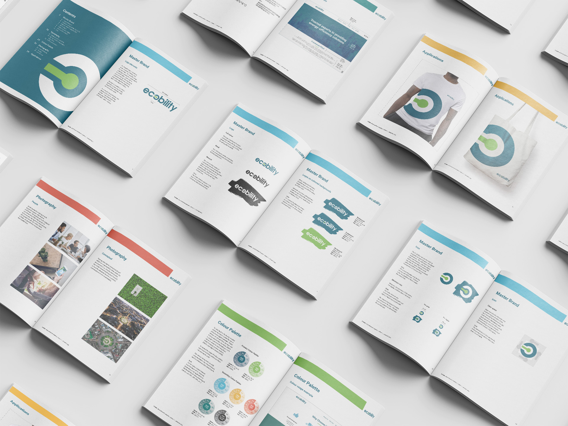
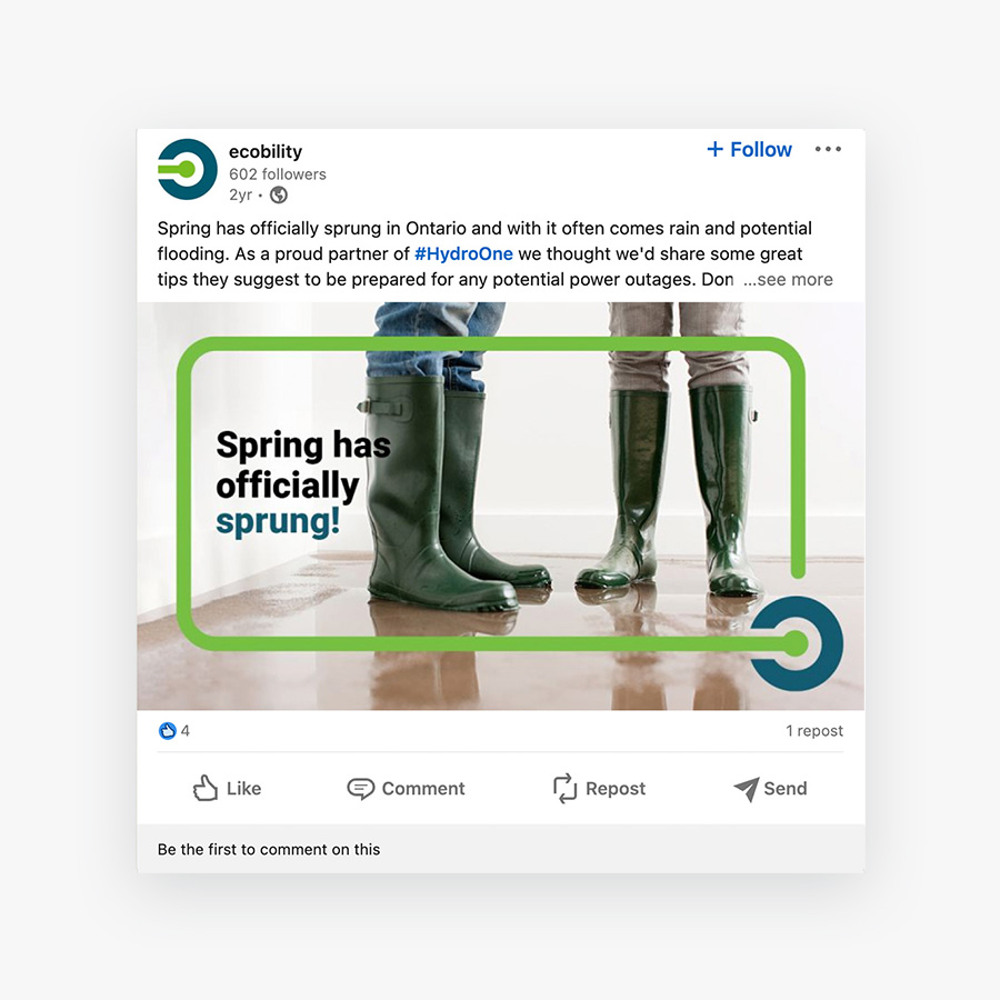
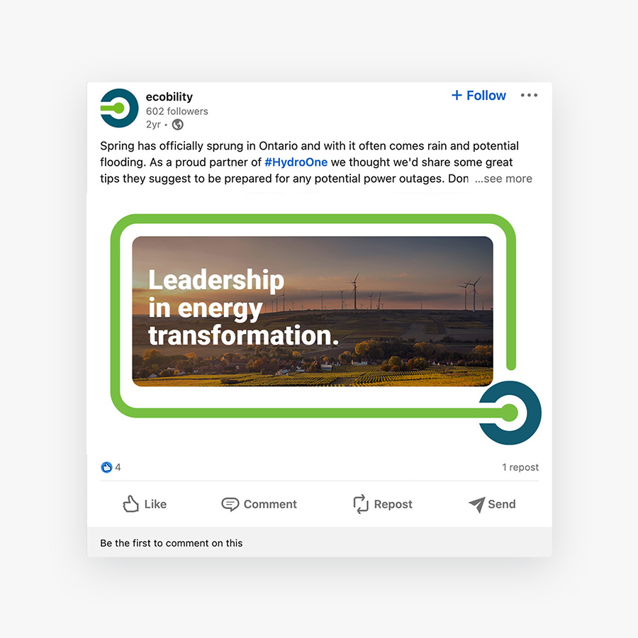
The new visual identity reflects their environmentally friendly positioning. A bright green graphic symbolizing an “on” button paired with lower-case type is approachable. New photography and icons enhanced the brand look with a clean, simple approach. The brand applications included website, specialized B2B presentations, customer certificate and brand standards guide.
The use of dark blue-green with a bright yellow-green accent colour gave the ecobility logo a modern yet approachable feel. Using a limited colour palette with white, Haft2 created a sense of clean energy and sustainability for the brand.
Results
Client and customer reviews indicated the new name was an easy transition and helped bring clarity to the work ecobility does. The new brand look aligns with the innovative approaches and clean energy solutions ecobility provides.