Sinai Health
Rebranding
Project location
Toronto, Canada
Project scope
Brand Guidelines
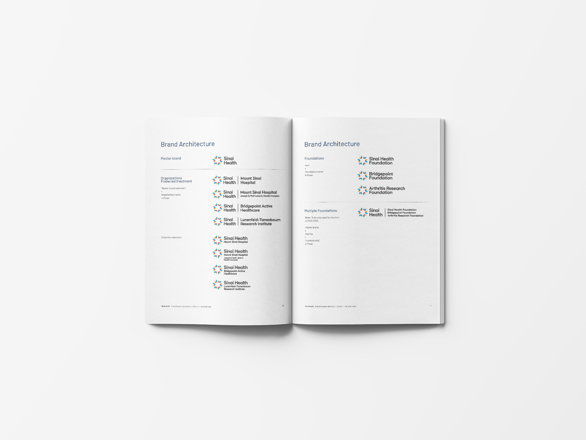
In 2019, Sinai Health Systems had multiple organizations under the Sinai Health banner. The lack of an overarching brand architecture created confusion across the organization on the positioning of properties and assets. Haft2 was engaged to simplify the Sinai Health architecture and create unifying positioning for the programs.

Solution
Haft2’s in-depth research included interviewing dozens of stakeholders. We united the multiple brands under a single name (Sinai Health), removing the word system to create a monolithic structure to always reference the master brand. We recommended one unified look and feel for the organization, building out the Brand Standards to connect as well. We reworked the original logo colours to be stronger and more versatile, and updated the colour palette, type and fonts, which were then applied to all hospital signage at each property. Our research, which led to the positioning, supported the new brand architecture, “See what care can do.”

Results
The simplified branding resulted in greater clarity and coherence for all entities in the Sinai Health family. The new brand architecture system was used for updating the majority of key programs within the organization.
